
Overhauling the way people search for jobs
Not many people really enjoy searching for a job - finding the perfect role, submitting your CV to various consultants, applying for vacancies in what you hope is the right way. What makes it easier is working with an agency who get what you’re after and who offer tools that make the whole online experience simple. That’s why, after a lengthy pitching process, 3rd sector recruiter Prospectus chose me and my team to overhaul their outdated site, which they knew wasn’t living up to their fine reputation. This is how my team and I challenged, questioned, debated and conceptualised. How we came up with ideas, and how we threw them out. How we reviewed, refined and tweaked, all to deliver a revolutionised way for people to search and apply for jobs.

Website visuals
MY ROLE
I worked on the project from its very formation to handover, and on continuing maintenance and improvements beyond that. From taking an integral part in the pitch, project management and planning, carrying out research, developing user experience ideas, designing visual concepts and helping to oversee the development and delivery, this was a 4 month project where I was a key member of the project team.
THE CHALLENGE
"Taking them from a great agency, to a fantastic agency."
Prospectus are a recruitment company that differ from the norm. They work in the 3rd sector - for non-profits, charities and the like - and they aim to be as ethical as their clients in their outlook. They don’t work to commission like many other recruiters, and they aim to create deep relationships with their clients and candidates. This philosophy wasn’t reflected in their website however. The navigation was unclear, and there wasn’t an easy way for people to search for jobs up front, meaning that it was a frustrating experience all round. They were savvy about what needed attention though, and approached my team with the attitude that the crux of the work was user experience based. That was what was going to take them from being a great agency, to an all-round fantastic agency. So, we got to work.
THE EARLY STAGES
"In-depth research, insightful answers."
New to recruitment, there was a lot to learn and understand, so some in-depth research was in order. Prospectus are their people, with all employees working on the frontline, with clients and candidates and with a keen knowledge of what they expected. Together with my team, I carried out extensive stakeholder and employee research, using interviews and surveys, to really find out about the inner workings of the organisation. We then moved onto user research, surveying website users on their interactions with Prospectus and the use of the website.

Discussing competitor research
This was followed by reviewing statistics, and I carried out intensive research into Prospectus's competitors from a brand and user experience point of view.
THE DEPARTMENTAL SPLIT
Our interviews with employees and stakeholders were incredibly interesting, and brought to the fore how the internal workings of the organisation were influencing how they and the website interacted with their users.
Prospectus work as four different internal departments, each dealing with a different type of client and candidate:

The four internal departments
This split was being communicated to users with the website, with little indication as to what the terms meant for them. Once a user was in the system and had been working with Prospectus, it was straightforward but for new candidates the split caused problems. Which category do I belong to? What if I straddle departments? Why do I need to know this? Some serious user experience work was required.
THINKING ABOUT THE USER
With the research complete, it was time to delve into the user experience phase of the project, the first task of which was to use our insights to draw up some personas and their associated user stories, which we then worked to prioritise so that we could develop the next stage of the project.

Developing user stories
With two distinct audiences to cater to, further sub-audiences within and the different internal departments to consider, my team and I conceptualised three different user experience ideas:
Low fidelity wireframe development
THE CANDIDATE FIRST APPROACH
With the crux of Prospectus's business being with the candidates (because what is a recruitment agency without the job-seekers?), the first concept myself and another user experience designer designed was the 'candidate-first' approach. It was something the CEO of Prospectus said to us during the interviews that stuck:
"The more jobs you have (on a website), the more that you'll get."
Meaning the busier and more in-demand you look as an organisation, the more clients come to you to handle their recruitment needs. The led us to believe that a candidate-driven website was a definite possibility, creating effectively a large jobs board under the assumption that clients would be willing to look a little harder for their information.

The candidate-first approach homepage wireframe
THE EVEN SPLIT APPROACH
Another concept we decided upon was the even split approach, where the website would deal with both of the core audiences, candidates and clients, equally, with clear calls to action for each.

The even-split approach homepage wireframe
THE DEPARTMENTAL APPROACH
Understanding that Prospectus had ingrained ways of working that functioned well for them, we also developed the concept of retaining the departmental split on the website, but with more contextual information so that the user knew exactly where they sat. This approach would allow each department to effectively have their own homepage, customised for their audience.
Myself and my colleague then presented our concepts to the client - the the CEO, the business manager leading the project and all four heads of department. It was a lively meeting with strong opinions and honest debate which prompted them to really think about how their business was run and how that comes across to their users.

The departmental approach homepage wireframe
Something we discussed in the meeting really hit home with Prospectus. When you enter their offices, they have a welcoming reception area with a friendly receptionist waiting to help you. Why shouldn't the website recreate this experience? It should welcome both sets of users equally and guide them to the right place, whichever department that was. From our research, we knew that being presented with all four departments up-front was confusing for a lot of users, but with guidance it all made sense. So, drawing upon the agreed user experience concept of an even split, I set to work refining our thoughts, and out of this came the idea of, what we termed, guided search.
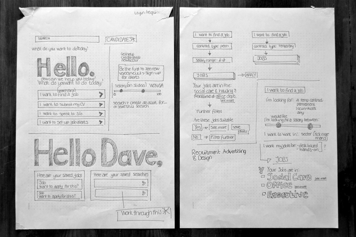
GUIDED SEARCH
"So, instead of asking users to make a decision without much information, instead guided search asks them simple questions."
The concept of guided search was really aided by our user stories that we developed and sorted in the early part of the project. There were really only a few major journeys that a user would take, definite tasks that they wanted to complete. From a business perspective, all users had to eventually be directed to the appropriate department so that they could be aided effectively. So, instead of asking users to make a decision without much information, instead guided search asks them simple questions - who are you and what are you looking for - and gives the appropriate options clearly. Talking directly to the user through copy and clear questions added that much needed human element, taking them to where they need to be on the website.

Guided search
USER TESTING
Having hit upon a user experience that me and my team thought answered the brief, and that Prospectus were all for, I developed some initial visuals so we could test our assumptions. Myself and my colleague spent an enjoyable afternoon at our client's offices testing a basic visual prototype with users that encompassed each audience type. We gave them some key tasks to perform and watched how they did it, asking them to talk through their thought processes as they did so. For the most part, it worked! Some tweaks were definitely required to button positions and wording, but the premise of guided search resonated with the users and all were able to intuitively navigate the prototype with relative ease.
BRINGING IT ALL TOGETHER
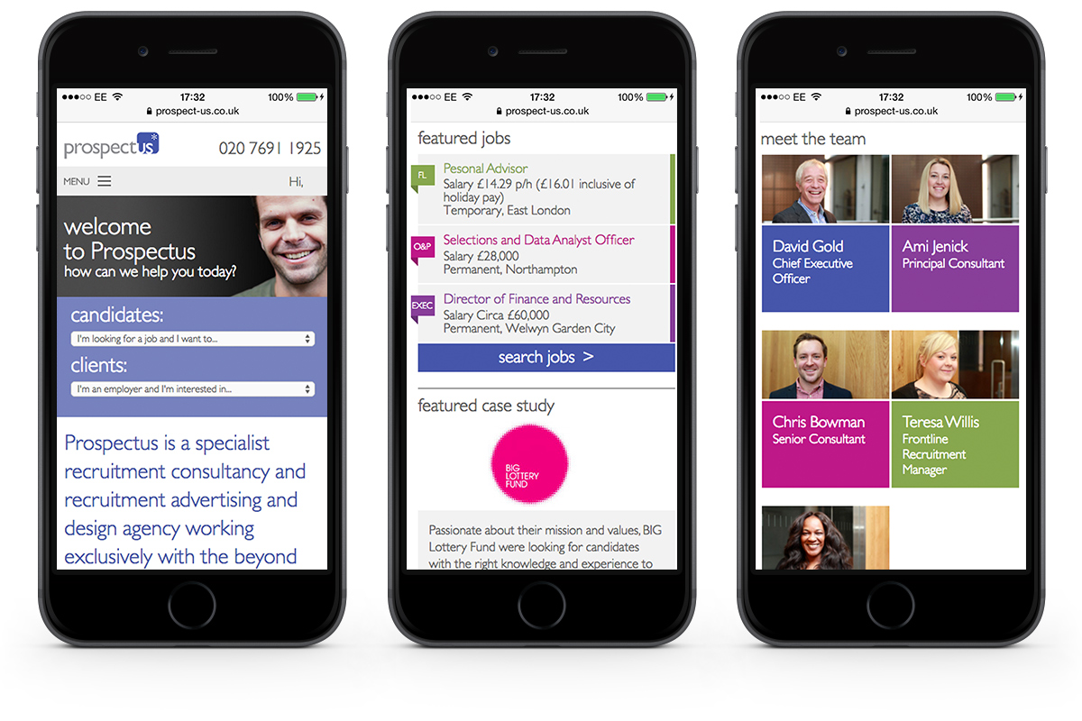
With a brand in place, my next job was to develop a full UI that was welcoming and inclusive. I designed visuals that would work across all devices. All the way through the project, I worked with my development team to ensure they were all on board with where we were taking the site, and to ensure they had full understanding of what was required. With visuals agreed, we worked in tandem to create a working site and CMS, me working on further visuals and UX as and when required, the develpment team bringing it all to life. After a certain point, I also helped them with general testing and bug reporting and together we created a responsive site that we and our client are proud of.

Prospectus homepage


NEXT STEPS & TAKE-AWAYS
Having worked closely and well with the Prospectus team, we developed a strong relationship that has meant that I've worked on further UX projects for them. Overall this project was a success, and the thorough research and UX phases that we went thorough aided that hugely. We've had some great feedback! There's always more that can be done though, and some of the later projects have addressed these niggles. For example, once a candidate is signed up and using the website as a recruitment resource, the functionality available to them was limited, particularly for people who work with Prospectus often as freelancers. They could add CVs, look for jobs, all the usual. But they had to submit invoices and timsheets through a separate system with no link up between the offerings. A subsequent UX project allowed me to look at how they could move more of their processes into one system.

Feedback
For more see prospect-us.co.uk