
Conceptualising spread betting
account management
In late 2015, one of the UK’s major spread betting brands revolutionised their offering, allowing users to trade seamlessly across multiple accounts. For the busy trader juggling strategies, this was a game-changing introduction. Having worked on the UX for browser-based devices, I was then challenged to conceptualise user experiences for a revitalised mobile app.
MY ROLE
"The client was open to using the app as a test-bed that would lead the way for future development on the desktop and other platforms, and so were keen to create some high-concept scenarios that could be worked towards as a longer-term goal."
Working closely with the client’s internal product manager, I was tasked with developing a number of conceptual user experience approaches for the app, addressing some core requirements and developing concepts for new functionality with the focus on account interation rather than trading. The client was open to using the app as a test-bed that would lead the way for future development on the desktop and other platforms, and so were keen to create some high-concept scenarios that could be worked towards as a longer-term goal. I was responsible for all phases of the project, from project management and planning, to developing concepts and presenting findings to the client.
THE CHALLENGES
"One login, multiple accounts."
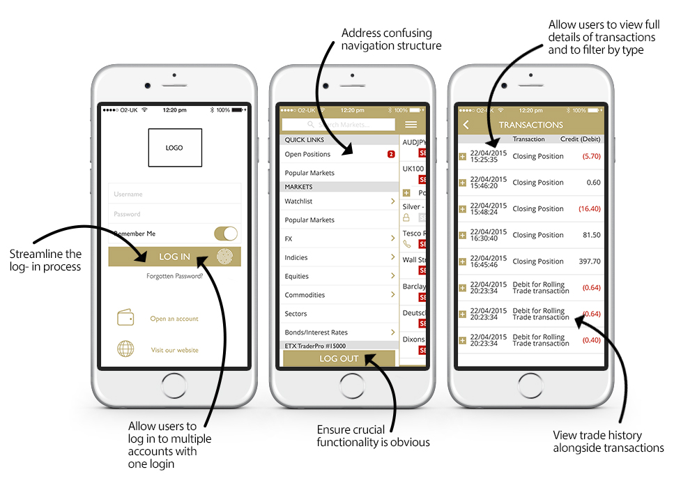
The client had a number of main objectives, the biggest of which was to how to allow users to see and interact with all of their accounts with one login. As part of the website refresh, the client had evolved from offering users single accounts with separate logins, to linked accounts that allowed a customer to easily switch between them. This was yet to be addressed on the mobile app and so was the main focus of the project.
Other issues involved reworking the way information was presented within the app, with a known problem being the confusing navigation with no distinction between trading and account information.
Issues with the existing app that were to be addressed
THE EARLY STAGES
"Getting into the mindset of the trader on-the-go."
Having worked with the client for a long time on larger projects, the first steps involved collating previous research that had been undertaken into user types and behaviours. Of course, not wanting to rely what I thought I knew, it was imperative that this approach was expanded with a clear focus on the specific requirements. Stakeholder and development team knowledge was invaluable, allowing me to understand the business challenges in more detail. Their insight into feedback from users contributed to my understanding of the main user needs.
Research into trading with the client app, as well as using competitors’ offerings, allowed me to get into the mindset of the trader on-the-go, and to see what experiences they were used to. During discussion with the client team, it became clear that looking at trading platforms was all well and good, but many of them have similar problems with complexity. Thinking around the problem, we realised that many banking apps offer similar interaction in an intuitive way, so looking at these was included in my competitor research.
THE PROCESS
"Collating and categorising information."
With research gathered, two clear main tasks revealed themselves. Firstly, to capture all required and desired functionality through user stories and journeys, and secondly to organise that information. Naming schemes were crucial, as it had been discovered that users felt confused with some of the terminology. The distinction between 'account' and 'profile' for example was felt to be problematic.

Low-fidelity wireframes detailing navigation concepts
Knowing that I was working with a view to early user testing meant that I could work rapidly to get ideas down and ready for sharing. Taking all of the requirements into account meant first detailing ideas through low fidelity wireframes, allowing me to get concepts down quickly and with focus. Three different approaches were detailed and developed into interactive wireframe prototypes in order to take the ideas through into user testing.

Low-fidelity wireframes detailing login and account switching concepts
CONCEPT 1: EASY ACCOUNT SWITCHING
"Switch with a swipe."
Because traders often use different accounts for different strategies and tactics, it is imperative that they know which account they are using at any one time, and can switch between them quickly. The first concept took the busy trader directly into the app, with functionality that allowed them to instantly switch accounts with a swipe.
A static bottom navigation allows a user to instantly access all of their main account functionality, or switch directly to trading.

Concept 1: Easy account switching
CONCEPT 2: UP-FRONT ACCOUNT INFORMATION
"Your active account at-a-glance."
This version presents a user with all of their linked accounts up-front, allowing them to choose which to use. Once a user is in app, they are using only one of their accounts and have to make a definite decision to switch. The ability to switch accounts and all other all functionality is detailed in the bottom icon-led navigation allowing easy, visible access without too many clicks.

Concept 2 : Up-front account information
CONCEPT 3: A STREAMLINED NAVIGATION
Streamlining the standard top-level navigation to distinguish between the trading options and account functionality. This concept retained much of the current app functionality, with tweaks addressing the main user stories, as an option which could allow the client to develop quickly without too much change for existing users but which made navigating the app a clearer process.

Concept 3: A streamlined navigation
THE RESULTS
With the conceptual prototypes with the client and currently in user testing, full feedback has yet to be collated and actioned.